Navigation that guides every click.
A visual editor for every menu on your site — header, footer, and the way each one rearranges itself on mobile — so a visitor finds what they're after in one or two clicks, not five.
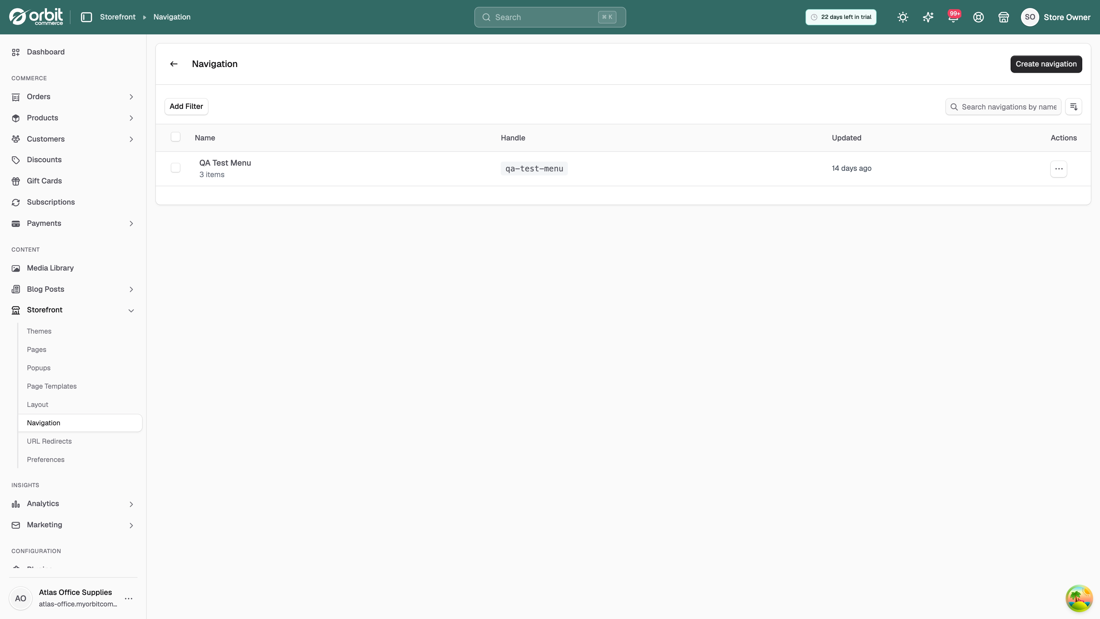
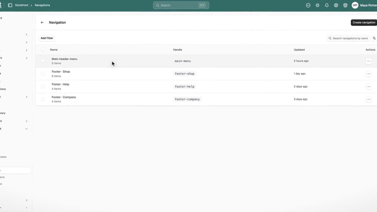
Navigation management
Menus built for your business.
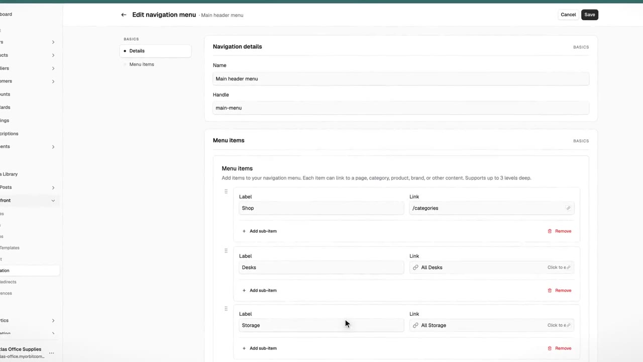
Drag, drop, done
Drag menu items into the order you want. Link to a collection, a product, a page, a blog post, or anywhere else — in seconds, without code.
A menu for every location
Build a separate menu for your header and each footer column — each with its own items, all managed in the same place. Mobile follows the header automatically.
Multi-level navigation
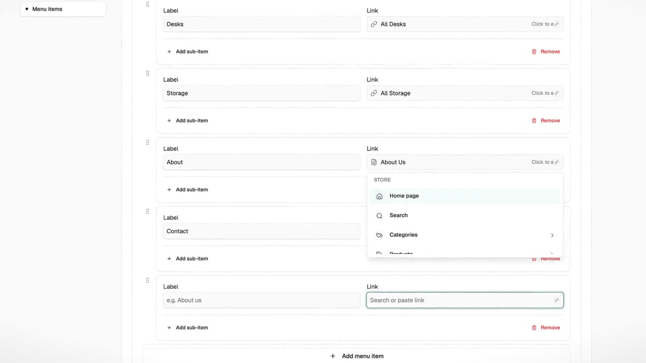
Add dropdowns inside dropdowns for stores with bigger catalogues. A visitor looking for a specific range can get there in two clicks instead of five.
Total flexibility
A menu item can point to a collection, a product, a page, a blog post, an external site, or a spot within a page. Mix them however your site needs.
The small things that add up
The bits of a header and footer that matter.
Built in — not stitched together from apps and plugins. Turn them on when you need them, leave them off when you don't.
Turn on a search bar or search icon. Visitors can type what they're after instead of hunting through menus.
Keep the header visible as visitors scroll, or have it hide on scroll down and return on scroll up. Pick per site.
A cart icon in the header with the current item count. Tapped once, opens the basket from anywhere on the site.
A link that sends visitors to sign in if they're logged out, or straight to their account if they're already in.
If you sell in more than one currency, Orbit detects where a shopper is browsing from and shows prices accordingly — with a dropdown in the header so they can switch if it's guessed wrong.
Turn on breadcrumbs so visitors can see where a page sits — and jump back up a level without hunting for the menu.
Put your logo on the left, in the centre, or on the right. Pick the layout that suits your brand — no code.
Link Instagram, Facebook, YouTube, LinkedIn, and X from the footer. Choose outline, filled, or rounded icon styles.
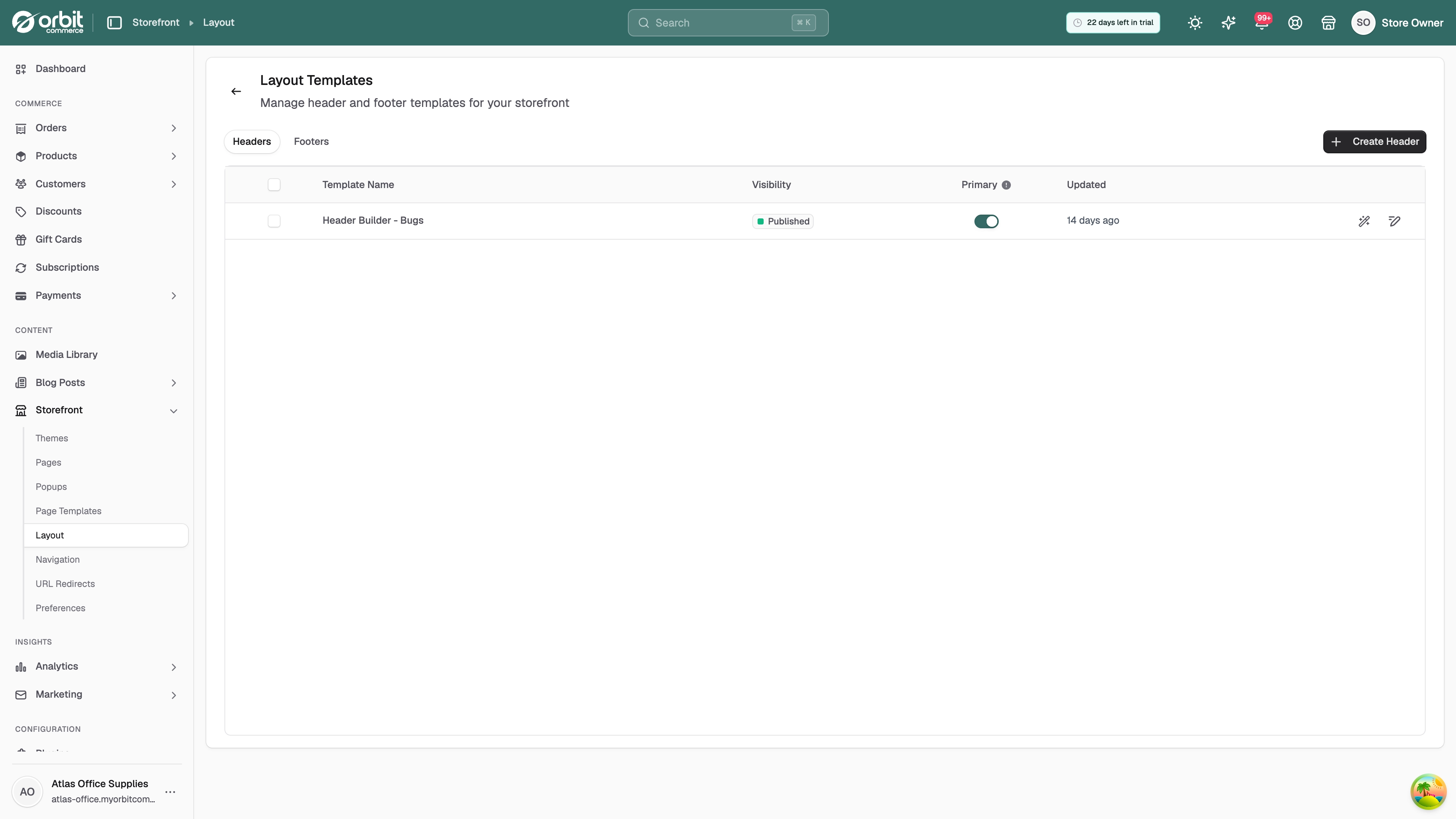
Headers & footers
First and last impressions, nailed.
The parts of the site a visitor sees on every page — edited in one place, tidy on phones without extra work.
Header layout
Pick where your logo sits, turn on a search bar, cart icon, account link, or currency switcher — all from settings, no code.
Footer customisation
A footer with the link columns you actually need — contact, social, newsletter signup, legal. Edit it once, every page picks up the change.
Mobile menu
The same menu on mobile, rearranged into a hamburger with a full-screen overlay. You don't configure it separately — it just follows.
Menus are the map. Pages are the destination.
Every link in your navigation points somewhere — and every one of those pages is yours to design, block by block, in the Page Builder.
Explore the Page Builder
Questions, answered.
Common questions about menus, headers, footers, and mobile navigation in Orbit. If yours isn't here, the help centre goes deeper.
Make your store easy to get around.
No credit card required. Your first menu takes minutes.