Here is something worth sitting with. A visitor landing on your shop for the first time usually decides whether you sell what they want before scrolling. They do it by reading the menu.
Not your homepage copy, not your hero image, not your carefully written brand story. The menu. It is the fastest answer to the only question they have, which is "do these people have the thing I am looking for".
Which makes navigation one of the highest-leverage things in a shop, and one of the least examined. Most menus are a fossil record of the order ranges were added in, rather than a considered map of what you sell.
What you can build
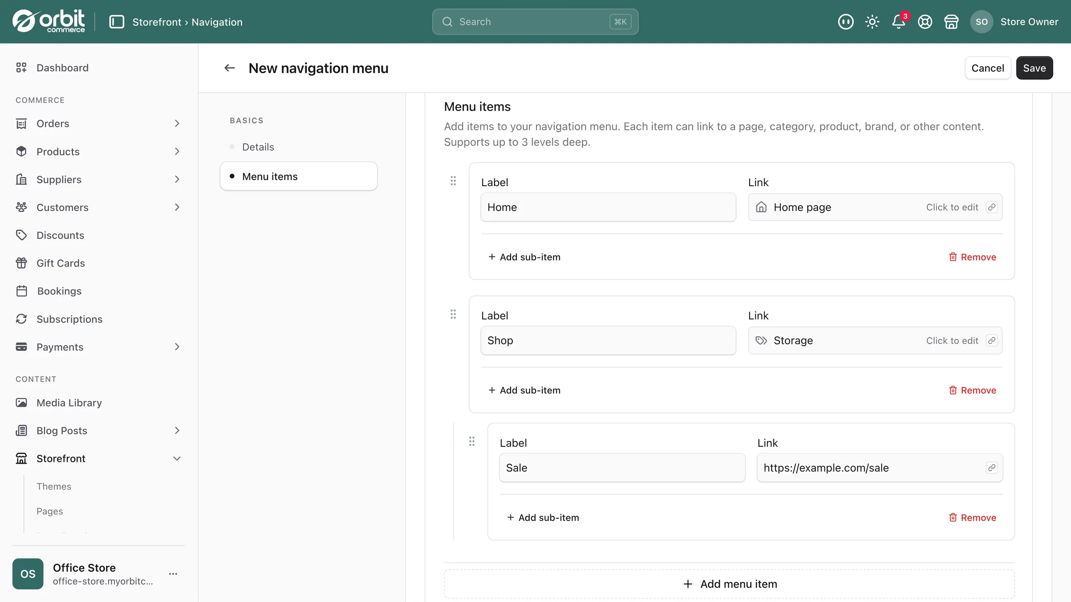
Menu items are dragged into the order you want, and a menu item can point at almost anything: a collection, an individual product, a page, a blog post, an external site, or a specific spot within a page. Mix them however your shop needs.
You build a separate menu for your header and for each footer column. Mobile follows the header automatically, so there is no second mobile menu to keep in step and no risk of the two drifting apart.
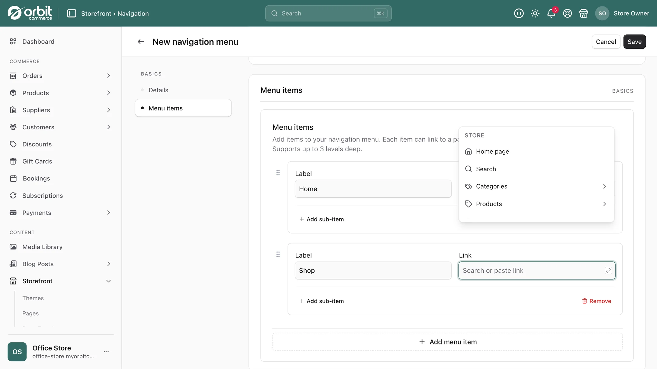
For bigger catalogues you can nest dropdowns inside dropdowns, so someone hunting for a specific range gets there in two clicks instead of five. Which is the whole game: every extra click is people leaving.
Header details that quietly matter
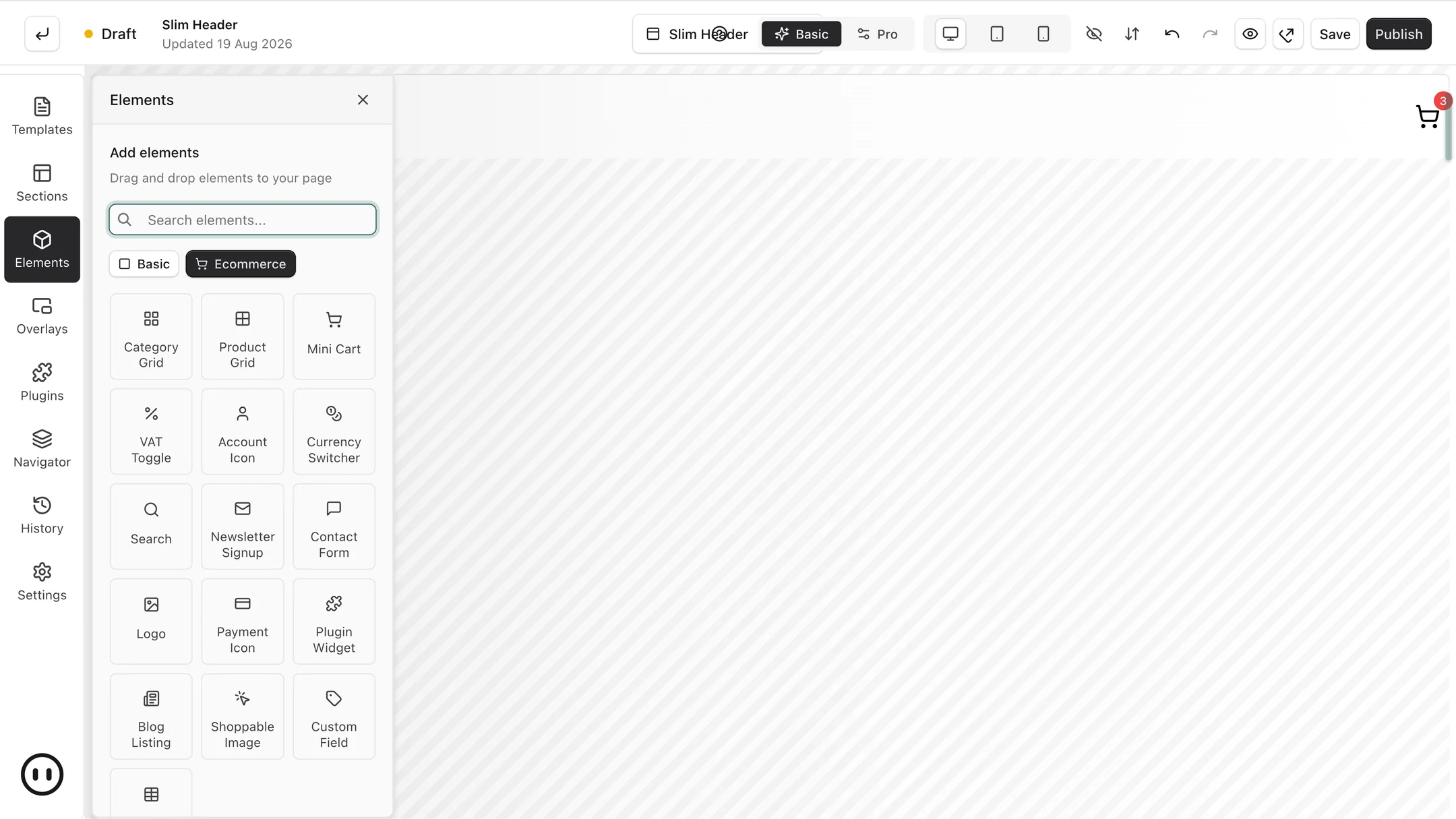
The header is small and it does a surprising amount of work. The controls worth thinking about:
- Search in the header. If you have more than a couple of hundred products, search is how your most valuable visitors navigate. Someone using search usually knows what they want and is closer to buying than a browser.
- Sticky header. Keep it visible as people scroll, or have it hide going down and reappear coming up. Either beats making somebody scroll to the top to get anywhere.
- Cart icon with a counter. Shows what is in the basket and opens it from anywhere. The counter is a genuine nudge, because a visible "2" is a reminder that a decision is half made.
- Account link. Returning customers hunting for their order history is a support email you did not need to answer.
- Currency switcher. If you sell abroad, showing prices in the visitor's currency removes a real hesitation at exactly the wrong moment.
- Breadcrumbs. Let visitors see where a page sits and jump back up a level without going hunting. Especially useful for anyone arriving on a deep product page straight from search, which is most people.
How to structure a menu that works
Name things the way customers do, not the way you do. Your internal range name means nothing to a first-time visitor. If people search for "wax melts", the menu should say wax melts, not the name you gave that product family.
Keep the top level short. Five to seven items. Beyond that people stop reading and start scanning, badly. Everything else belongs one level down.
Add a menu for how people shop, not just what you sell. Alongside product categories, headings like "gifts under £30", "new in" or "back in stock" often outperform everything else, because they match the way somebody is actually thinking.
Give the footer a job. Footers get treated as a legal dumping ground. They are also where people go looking for delivery information, returns policy and how to contact you, which are the three things a hesitant buyer wants before they commit. Clear links there measurably reduce abandonment, and your returns policy needs to be findable anyway for free Google listings.
Revisit it when the catalogue changes. Menus decay. A structure that fitted forty products is wrong at four hundred. Look at it properly twice a year.
Setting it up
- Write your top level on paper first. Five to seven headings, in customer language. Do this before opening the editor.
- Build the header menu by dragging items in and pointing them at collections, pages or products.
- Add nesting only where the catalogue justifies it. Dropdowns on a small shop are friction, not sophistication.
- Build the footer columns with delivery, returns, contact and about. These are the trust links.
- Turn on the header extras you need: search if your catalogue is big, currency switcher if you sell abroad, breadcrumbs almost always.
- Test on a phone, because the mobile menu is the one most of your visitors will actually use.
Good to know
Good categories come first. File products the way people shop and the menu has something clear to point at, so treat it as a catalogue job before a menu one. Custom fields help, because they let you group by things like scent, fit or room.
Fewer, clearer links win. The instinct when something is hard to find is to add another link. Usually the fix is fewer, clearer options.
Menus show wherever you place them. The navigation editor sets the structure, and a Menu block puts a list in a header, a footer column or any page, with your theme and the page builder setting the look.
Questions people ask about navigation
How many items should my main menu have?
Five to seven at the top level. Past that people stop reading and start scanning, and scanning misses things. Everything else belongs one level down in a dropdown. If you cannot get below seven, that is usually a sign the categories themselves need rethinking rather than the menu.
Can I have a different menu for the footer?
Yes. You build a separate menu for the header and for each footer column. Give the footer a real job rather than treating it as legal small print: delivery, returns, contact and about are the links hesitant buyers go looking for before they commit, and a findable returns policy is also a requirement for free Google product listings.
Do I need a separate mobile menu?
No. Mobile follows the header automatically, so there is nothing separate to maintain and no risk of the two versions drifting apart. Do check it on an actual phone before you finish, because the mobile menu is the one most of your visitors will use.
Can menu items link to something other than a collection?
Yes. A menu item can point to a collection, an individual product, a page, a blog post, an external site, or a specific spot within a page, and you can mix those freely. That is what lets you build headings around how people shop, such as gifts under £30 or new in, rather than only around how your catalogue is organised.
The short version
Your menu answers the only question a new visitor has, so write it in their words rather than yours. Five to seven top-level items, nesting only when the catalogue earns it, and a footer that carries delivery, returns and contact rather than just legal links. Turn on search if you have a big catalogue and breadcrumbs almost always. Then check it on a phone, and look at the whole thing again in six months.
What this saves you buying
On most platforms the things above arrive as separate paid apps. On Orbit they are part of the plan.
| What you would otherwise buy | The cost elsewhere |
|---|---|
| A mega-menu app | a monthly bill on top of your plan |
| Developer time to add a menu item | a day of waiting, every time |