The real cost of not having a page builder is not money. It is the sale you did not run.
You have an idea on Monday. A bank holiday promotion, a new range to feature, a banner explaining that orders placed after Thursday will not arrive before Christmas. You message whoever handles the website. They get to it on Wednesday. There is a back and forth about the wording. It goes live Friday, and by then the moment has gone or the promotion has half a weekend left to run.
Multiply that by every idea you have had and quietly dropped because it was not worth the hassle, and you have the actual price of not being able to edit your own shop.
What it actually is
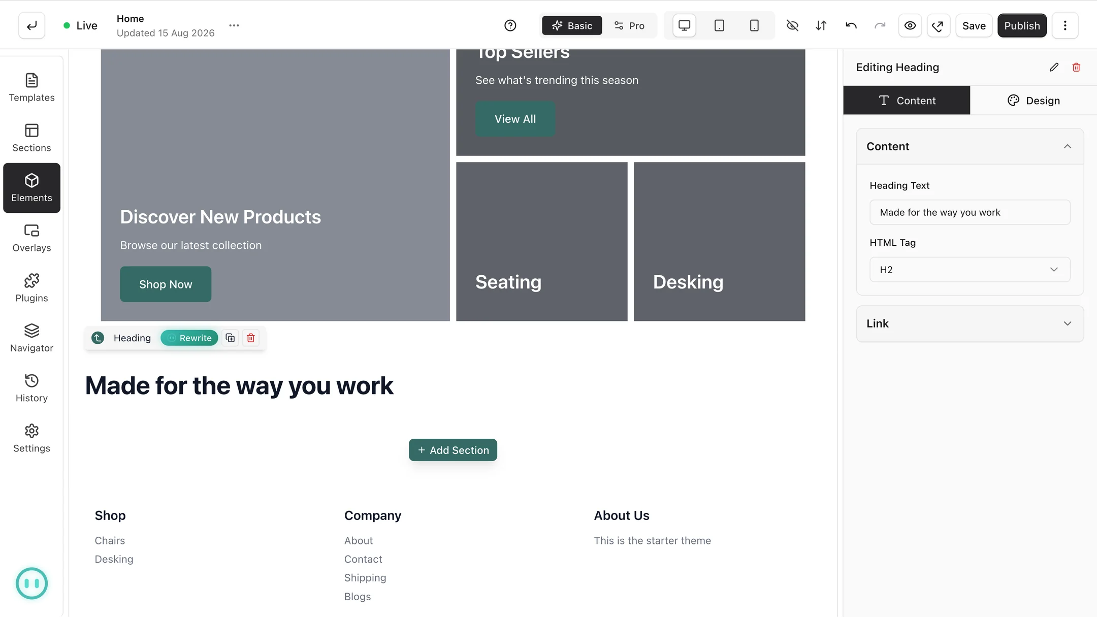
A page in Orbit is built from sections stacked down the screen. A hero banner, a row of featured products, some text, a testimonial, a sign-up form. You drag the ones you want onto the page, arrange them in the order you like, and edit the contents by clicking on them.
What you see while editing is what the page will look like. There is no separate preview step where you find out it went wrong, and you can flip between desktop, tablet and phone views without leaving the editor. Every section is built to work at all three sizes to begin with, and you can adjust each one individually when a headline that reads well on a laptop turns into six lines on a phone.
You are adjusting colours, fonts and spacing with normal controls rather than typing anything. The code is still underneath if someone on your team wants it, but nobody needs to touch it to run a sale.
Start from a section, not a blank page
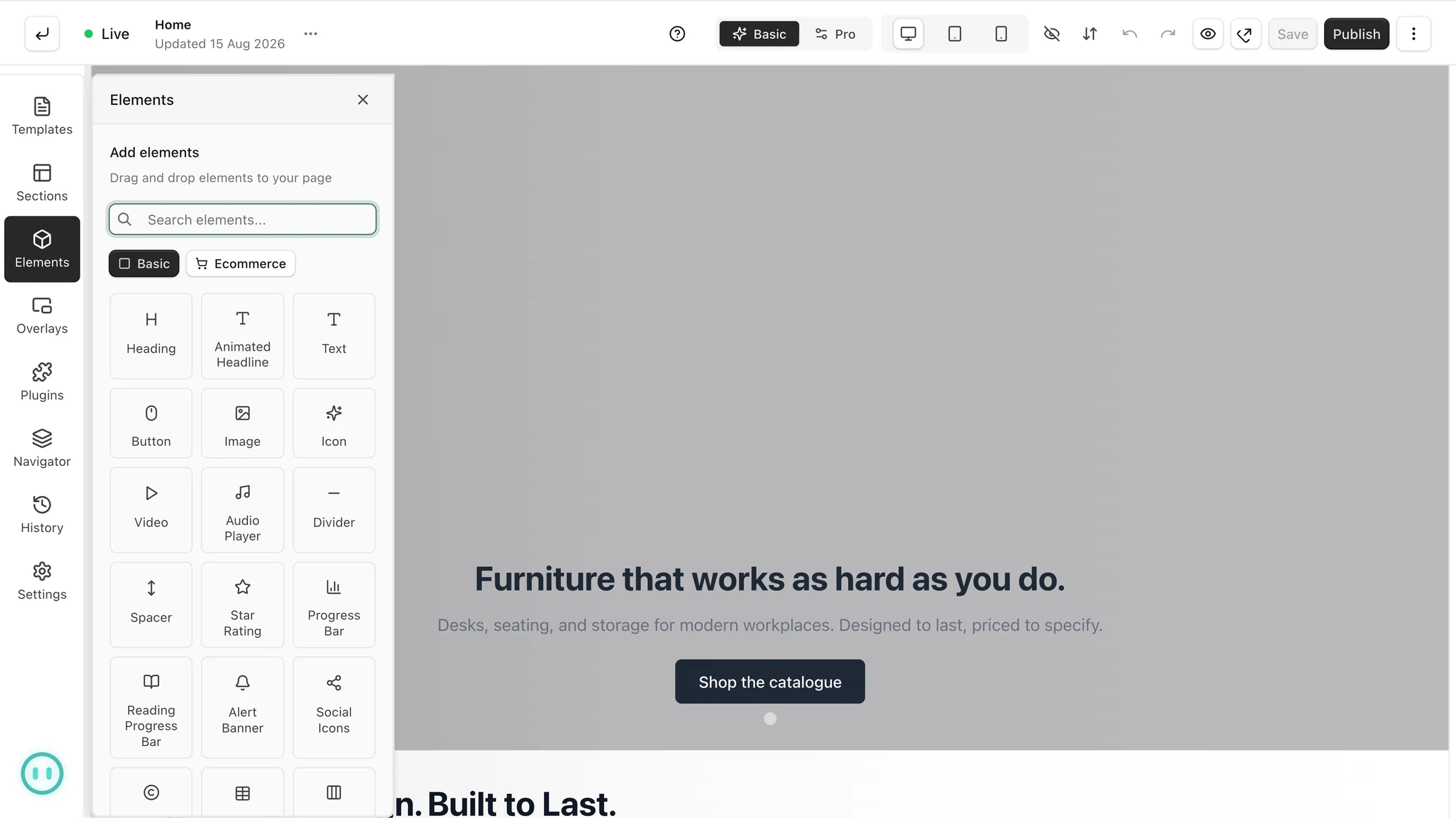
The blank page is where most people give up. So do not start there. Orbit ships with ready-made sections that already look right: hero banners, feature grids, testimonial blocks, pricing tables, product rows. Drop one in and change the words and pictures to yours.
This matters more than it sounds. A shop owner given a blank canvas and a set of alignment controls will produce something that looks like a shop owner given a blank canvas. A shop owner given a well-made hero section and asked to change the headline will produce something that looks professional, in four minutes.
The two features people underuse
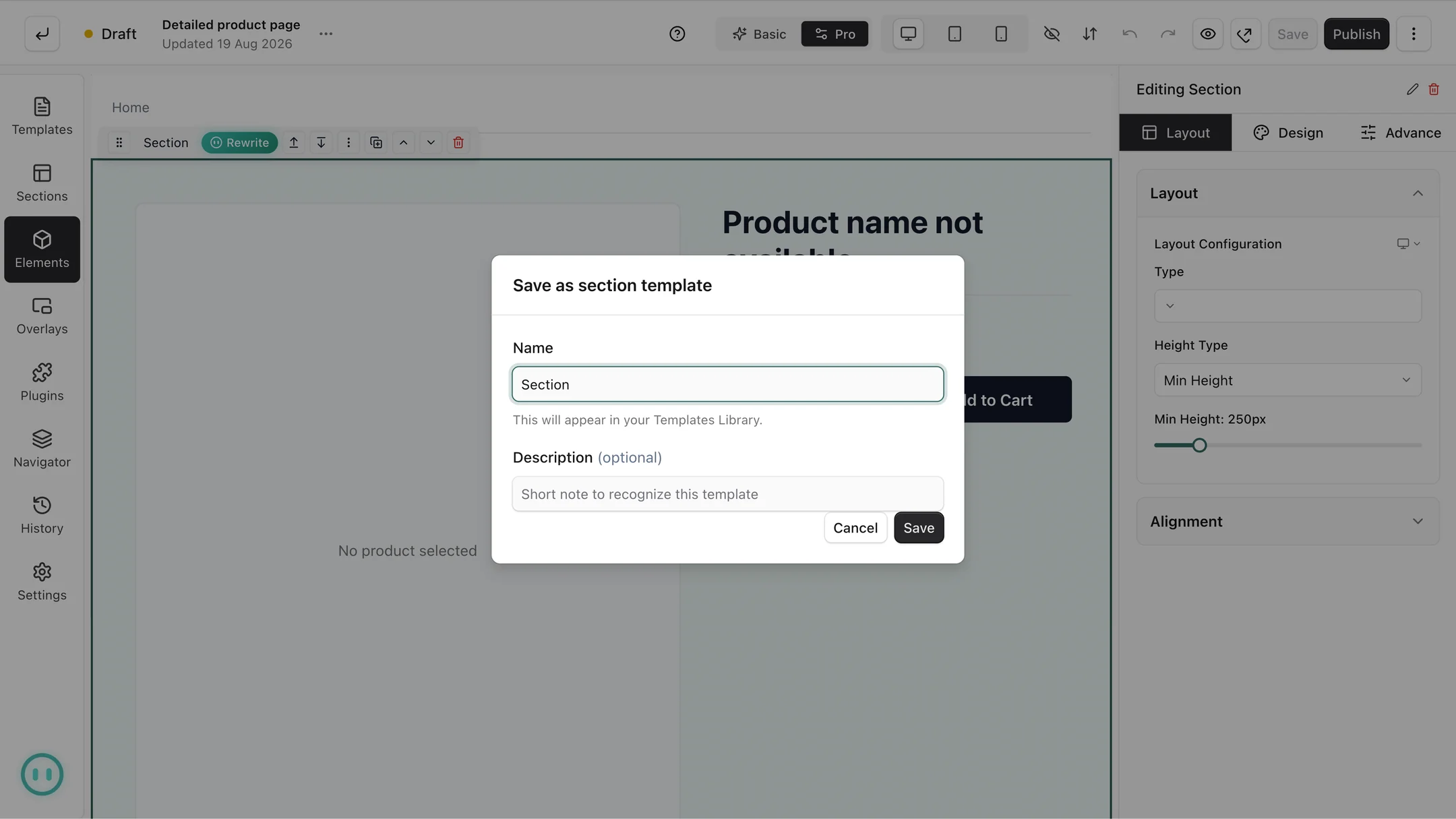
Reusable sections. Build something once, save it, and use it on any page. Your delivery promise, your stockist logos, the "any questions" block with your phone number. Build it well once instead of rebuilding it slightly differently on six pages.
Saved templates. Turn a layout you like into a template you can start from. If you run four promotions a year and each needs a landing page, the second one should take ten minutes rather than an afternoon, because you start from the first.
Together these are what stops a shop drifting into looking untidy. Consistency is not achieved by being careful every time. It is achieved by not rebuilding things.
Pictures and video, without the faff
Everything you upload is optimised automatically and sits in your media library ready to drop into any page. Large photos straight off a camera get handled rather than left to slow your shop down, which matters because page speed is something both customers and Google notice. Our guide on a storefront that feels instant covers why.
One quietly brilliant detail: swap a file once and it updates on every page that uses it. Change your logo, or replace a product photo, and you are not hunting through pages trying to remember where the old one is still lurking.
Headers, footers and menus stay in one place
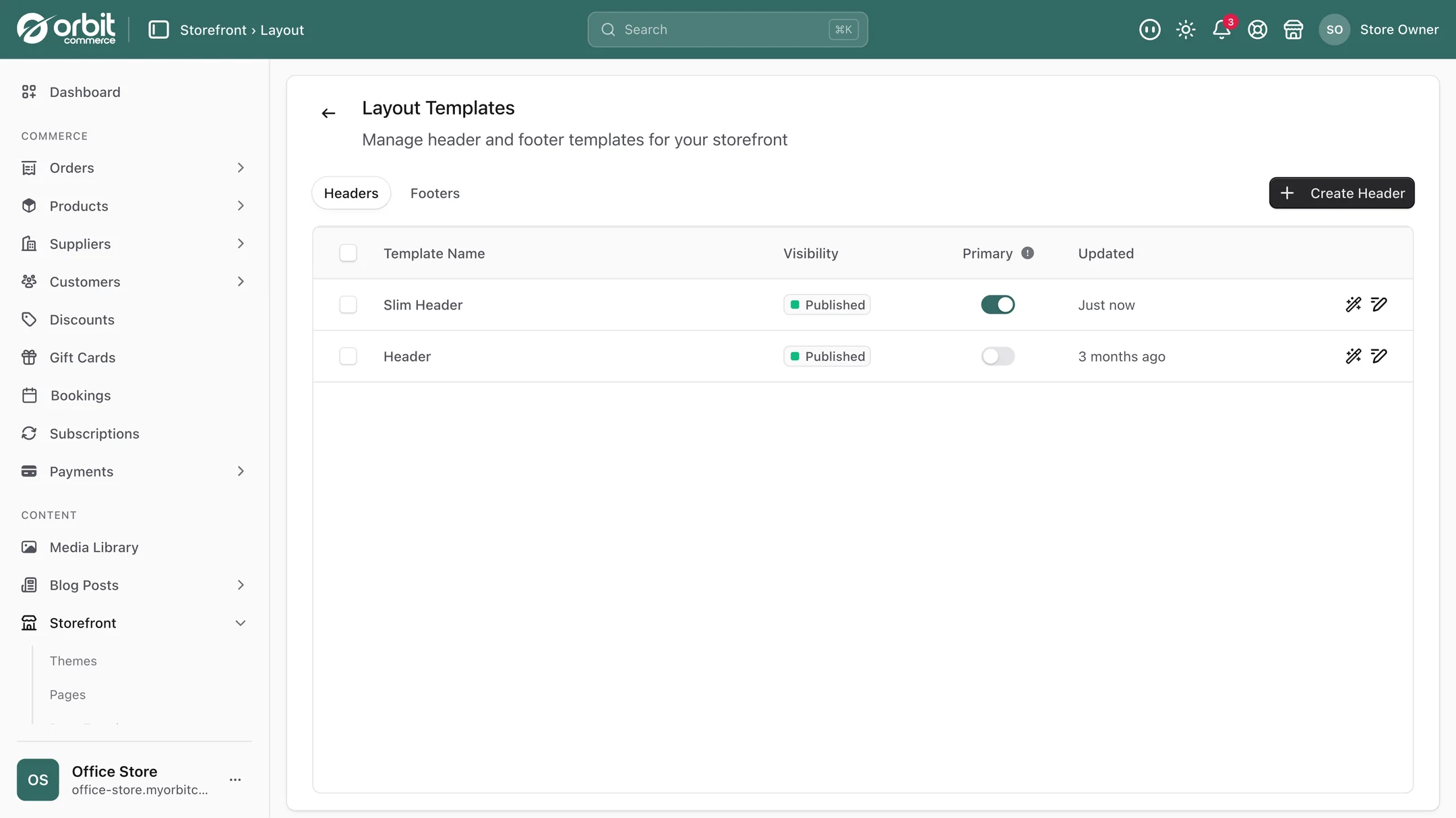
Your header and footer are templates of their own, dropdown menus included, rather than being rebuilt per page, so every page you build automatically sits inside the same frame. Add a new category to the header's menu once and it appears everywhere, which is precisely what you want and precisely what does not happen when a header is copied onto forty pages.
What shops actually build with it
A sale landing page, on the morning you decide to run a sale. Start from your saved promo template, change the headline and the products, publish. The point is the timing, not the page.
A proper about page. The one every small brand knows it should write and never does, because it means asking someone. Photos of the workshop, the story, the faces. For a small brand this page does more selling than most product pages.
Seasonal delivery information. The Christmas cut-off banner, put up in five minutes and taken down in one. Not worth a developer ticket, absolutely worth doing.
A landing page per campaign. If you are sending traffic anywhere, sending it to a page written for that audience converts better than sending it to your homepage. Cheap to make once you have a template.
A stockists or wholesale enquiry page. A form, some trade information, and a route for buyers who found you and want to order properly. Pairs with company accounts and trade pricing.
The trust page nobody plans. Delivery, returns, contact and who you are, laid out clearly. Boring, and it reduces both abandoned baskets and the number of emails you answer. Related: checkout quick wins.
Building your first page
- Pick something small and real. Not the homepage. A delivery information page, or a landing page for one product. You want a win, not a project.
- Start from a ready-made section rather than an empty canvas.
- Write the words first, roughly. Layout decisions get much easier once the actual text is in front of you, because you can see what needs room.
- Check the phone view before you publish. Most of your visitors are on one. Headlines that look punchy on a laptop often need shortening.
- Save anything you will want again as a reusable section or a template, while you still remember how you made it.
- Publish. You can change it in a minute, which is the entire point.
Good to know
Give each page one job. Fewer sections, more white space, one clear thing you want people to do. If a page is trying to say five things it will say none of them.
Your theme keeps every page consistent. Fonts, base colours and the overall look come from your theme, and the builder works inside it, so a page you build today matches the rest of the shop and your pages never drift apart.
Custom work, when you want it. The builder covers the pages a shop changes week to week, which is almost all of them. For an unusual interactive component or a bespoke integration, Orbit's custom development team, the people who write the platform, builds it for you. A new component arrives as an element in your page builder, ready to drag in.
Questions people ask about the page builder
Do I need to know how to code to use the page builder?
No. You build pages by dragging ready-made sections onto the canvas and editing them with normal controls for text, colours, fonts and spacing. What you see while editing is what the published page looks like, and you can check desktop, tablet and phone views without leaving the editor. The underlying code is accessible if someone on your team wants it, but nothing routine requires touching it.
Can I build landing pages for campaigns and sales?
Yes, and it is one of the best uses for it. Build the first one, save it as a template, and every subsequent campaign page starts from that rather than from nothing. Sending campaign traffic to a page written for that specific audience reliably converts better than sending it to your homepage, and the whole point is being able to do it on the day you have the idea.
Will pages I build work properly on phones?
Every section is built to work across screen sizes to begin with, and you can adjust individual sections for phone, tablet or desktop where you need to. Do check the phone view before publishing, because headlines that look right on a laptop often run to several lines on a phone. Most of your visitors will be on one.
If I change my logo, do I have to update every page?
No. Media is managed centrally, so swapping a file once updates it everywhere it is used. The same applies to headers, footers and menus, which are templates of their own rather than built per page, so a new menu item appears across the whole shop at once.
The short version
The value is speed, not aesthetics. Start from ready-made sections rather than a blank page, write your words before you fiddle with layout, check the phone view, and save anything you will want twice as a reusable section or template. Then use it for the small unglamorous things, the delivery banner, the cut-off notice, the campaign page, because those are the changes that were never worth a developer ticket and are absolutely worth making.
What this saves you buying
On most platforms the things above arrive as separate paid apps. On Orbit they are part of the plan.
| What you would otherwise buy | The cost elsewhere |
|---|---|
| A page-building app | a monthly bill on top of your plan |
| Developer time for routine layout changes | billed by the hour, every time |
| A separate landing page tool | another monthly bill |